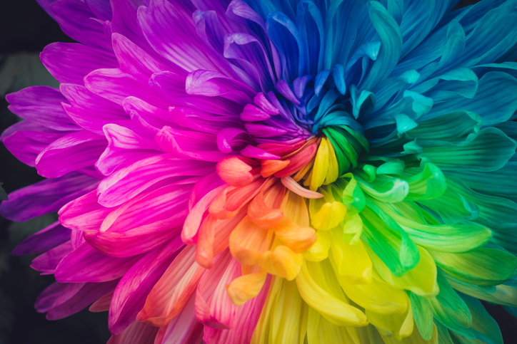
Add Zest to Summer Designs with 10 Hot Color Combos

It has been said that color is a power that directly influences our soul.
A common obstacle for designers is choosing colors. And you should not take this choice lightly! There is great energy in certain combinations – a good color palette will be unique, seductive, and harmonious.
Warmer seasonal temps offer a great chance to color outside the lines with playful, lavish options. Need inspiration? Here are a few feisty blends for your summer design toolbox:
10 Feisty Blends for Your Summer Design Toolbox
1. Cool Gray – Neon Orange – Plum Purple
These call-to-action colors bring a sense of health and vibrancy, with an air of sophistication and an invitation to adventure.
2. Magenta – Vibrant Turquoise – Black
Fire up confidence with bright shades that bring flavor and fun!
3. Sapphire Blue – Shadow Gray – Neon Yellow
Like a bright peacock feather, this gorgeous blue-green combination brings a royal, confident air to any page.
4. Bright Green – Dark Violet – Lava Gray
Like a sunset dip in the Caribbean, these rich colors satisfy the soul in a lush, confident array.
5. Flaming Fuchsia – Black – Sandy Tan
Want to steal the stage with your design? The bold contrasts in this palette exude vibrance, feminine strength, and a rugged road for the journey.
6. Solar Yellow – Electric Blue – Charcoal
When you want to add punch to your page, the rich extremes of this triad bring a fluorescent finish that is fierce yet fun!
7. Pearl Aqua – Cyber Grape – Daisy Yellow
These colors bring a burst of energy with bright hues and an interesting, sophisticated contrast.
8. Lime Punch – Cool Gray – Tangerine
Heat up appetites with this tropical, zesty arrangement that will compel people to give your business a try!
9. Terra Firma Green – Magenta – Sunlight Yellow
Like interwoven threads of a tribal mosaic, the sharp contrasts in this palette bring a sense of depth, mystery, and variety.
10. Carnation – Dark Lilac – Peachy Rose
Like a seashell deposited on a white-washed beach, this royal blend awakens a sense of purity and opulence, projecting an air of poise and splendor.
Find Your Favorites in Nature
Still looking for just the right blend? The natural world is a great place to look.
— The sunset is not just orange; it is apricot, bronze, mauve, and amber.
— A tropical beach is not just blue; it is turquoise, coral, tan, and chartreuse.
— A poplar tree is not just green; it is a mix of jungle green, lime, silver-green, light brown, cool gray, and white.
When you find a natural image that inspires you, snap a photo and take it to the drawing board. Sample distinct colors from different parts of the photo and examine which hues move you the most. Most compelling swaths from nature include a system of colors ranging from dark to light and intense to soft. Find what is unique and powerful about these grand images and replicate them in your own seasonal designs.
The psychological association of a color can often be more potent than a visual impression. So be intentional (but brave!) with your summer palettes, and let these blends sell for you!
